Scatter Plots
Scatter plots are used in statistics to visualize the relationship between two numerical variables. Each point in a scatter plot represents an individual record or observation from a dataset plotted against each other, one on the x-axis and the other on the y-axis.
By looking at a scatter plot, we can understand if there is a positive correlation between both variables (both variables increase or decrease together), a negative correlation (one variable increases while the other decreases), or no correlation between variables.
Scatter plots can also reveal the presence of distinct groups or clusters within the data. These clusters might indicate that the data points within each cluster share some common characteristics.
Scatter plots are also very helpful in detecting outliers, or data points that significantly deviate from the overall pattern of the data. These outliers may indicate anomalies in the data collection process, special cases, or errors.
Create a Scatter Plot in Matplotlib
To create a Scatter plot in matplotlib, we use the plt.scatter() function. Two required parameters are x and y. Let’s read a Penguin dataset. We will look at the relationship between flipper_length_mm and body_mass_g. You can get the data from here - matplotlib-python-book
# silence warnings
import warnings
warnings.filterwarnings('ignore')

# import pandas and matplotlib
import pandas as pd
import matplotlib.pyplot as plt
df = pd.read_csv("../data/penguins.csv")
df.head()
Penguins data for analysis
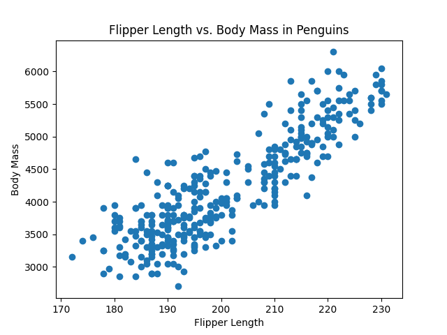
We will plot the flipper_length_mm on the x-axis and body_mass_g on the y-axis.
# create a scatter plot
plt.scatter(df['flipper_length_mm'], df['body_mass_g'])
plt.title("Flipper Length vs. Body Mass in Penguins")
plt.xlabel("Flipper Length")
plt.ylabel("Body Mass")
plt.show()
Penguins Flipper length vs Body mass
Looking at the graph it feels like there is a positive correlation between these variables. On average, Penguins with longer flippers weigh more than penguins with shorter flippers.
Marker Style
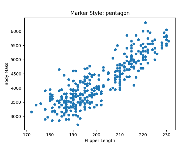
To change the markers’ style of the scatter plot use the marker parameter. There are various marker styles available in matplotlib which you can find here - marker styles
styles = ["^", "p", "*", "+"]
descriptions = ["triangle_up", "pentagon", "star", "plus"]

for style, desc in zip(styles, descriptions):
    plt.scatter(df['flipper_length_mm'], df['body_mass_g'], marker=style)
    plt.title(f"Marker Style: {desc}")
    plt.xlabel("Flipper Length")
    plt.ylabel("Body Mass")
    plt.show()
scatter plot with triangle up marker

Scatter plot with pentagon marker

Scatter plot with star marker

Scatter plot with plus marker
If you look carefully, you will see that I called the plt.show() function inside the body of the for loop because I wanted to create a separate plot for each marker type. If you specify the show function outside of the loop then each marker type will get plotted on the same figure. Go ahead and give it a try.
Marker Color
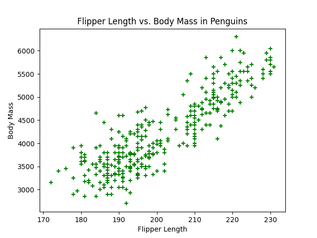
To change the marker color use the c or color parameter.
# scatter plot with custom marker style and color
plt.scatter(df['flipper_length_mm'], df['body_mass_g'],
           c="green", marker="+")
plt.title("Flipper Length vs. Body Mass in Penguins")
plt.xlabel("Flipper Length")
plt.ylabel("Body Mass")
plt.show()
Scatter plot with custom marker style and color
Marker Size
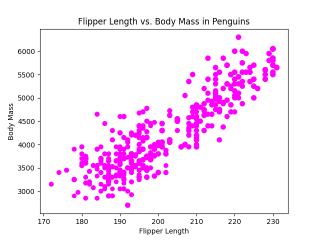
The s parameter controls the size of the markers on the scatter plot. You can specify s as a single number or as an array of sizes to give different sizes to each data point. This feature is particularly useful for representing an additional dimension of the data on a two-dimensional scatter plot like we do in a bubble chart.
# scatter plot with different marker sizes
plt.scatter(df['flipper_length_mm'], df['body_mass_g'],
           c="magenta", s=df['bill_length_mm'])
plt.title("Flipper Length vs. Body Mass in Penguins")
plt.xlabel("Flipper Length")
plt.ylabel("Body Mass")
plt.show()
Scatter plot with different marker sizes
Colorbar
We can also color the markers according to the size of the markers. For this, we have to first set the c parameter with the variable that specifies the size and then use the cmap parameter to map the data to colors and at last use the plt.colorbar() function to show the colorbar on the plot. To add a label to the colorbar use the label parameter. You can find various options for cmap here - colormap options.
# scatter plot with a colorbar
plt.scatter(df['flipper_length_mm'], df['body_mass_g'],
            c=df['bill_length_mm'], cmap='plasma')
plt.title("Flipper Length vs. Body Mass in Penguins")
plt.xlabel("Flipper Length")
plt.ylabel("Body Mass")
plt.colorbar(label='Bill length')
plt.show()
Scatter plot with colorbar
Scatter Plot with a Legend
To create a Scatter plot with a legend, add a label parameter in the plt.scatter() function and then add a plt.legend() function. Adding a label and a legend will help us identify different classes or groups within a dataset. For example, we can see how the Body mass and flipper length change based on the type of penguin species.
# get unique species
unique_species = df['species'].unique()

# plot scatter plot for each species
for species in unique_species:
    df_species = df[df['species'] == species]
    plt.scatter(df_species['flipper_length_mm'], df_species['body_mass_g'], label=species)

plt.title("Flipper Length vs. Body Mass by Penguin Species")
plt.xlabel("Flipper Length")
plt.ylabel("Body Mass")
plt.legend()
plt.show()
Scatter plot with a legend
Looking at this plot we can say that Gentoo species tends to have larger flipper length and higher body mass compared to Adelie and Chinstrap species.
Marker Transparency
The alpha parameter controls the transparency level of the markers in the scatter plot. The alpha values range from 0 to 1, where 0 is fully transparent ( the markers are invisible), and 1 is fully opaque (the markers are completely solid).
Using the alpha parameter is particularly useful in scatter plots with many overlapping points. This makes patterns in the data more apparent, especially in plots with large datasets.
# scatter plot with alpha parameter
plt.scatter(df['flipper_length_mm'], df['body_mass_g'],
            c='magenta', alpha=0.5)
plt.title("Flipper Length vs. Body Mass in Penguins")
plt.xlabel("Flipper Length")
plt.ylabel("Body Mass")
plt.show()
Scatter plot with alpha parameter
Understanding Correlation with Scatter Plots
The Pearson Correlation Coefficient is a statistical measure that shows the extent to which two variables change together. Its values lie from -1 to +1.
+1 indicates a perfect positive linear relationship, where all data points lie exactly on a straight line with a positive slope. This means that as one variable increases, the other variable also increases and similarly as one variable decreases the other variable also decreases.
-1 indicates a perfect negative linear relationship, where all data points lie exactly on a straight line with a negative slope. In this case, as one variable increases, the other variable decreases.
0 indicates no linear relationship. There is no linear predictability between the variables, as one variable increases, there is no consistent pattern of increase or decrease in the other variable.
Let’s try to understand this visually using a scatter plot. We will create synthetic data to demonstrate this.
# import numpy library
import numpy as np

# function for creating synthetic data
def generate_synthetic_data(correlation, n_samples=100, seed=None):
    if seed is not None:
        np.random.seed(seed)
    x = np.random.normal(0, 1, n_samples)
    y = x * correlation + np.random.normal(0, np.sqrt(1 - correlation**2), n_samples)
    return x, y
Next, we will define the number of samples and the range of correlation values. We will create multiple subplots in a single row using the plt.subplots() function. We will learn more about subplots in a later chapter in greater detail. We will also use the plt.tight_layout() function which makes sure that the titles, axes, and labels of two subplots do not overlap and the overall layout looks clean and well-organized.
# Define the number of samples and correlations
n_samples = 100
correlations = [-1, -0.5, 0, 0.5, 1]

# Total number of plots
total_plots = len(correlations)

# Create a figure to hold all subplots
plt.figure(figsize=(total_plots * 4, 4))  # Adjust the size as needed

for i, correlation in enumerate(correlations):
    # Position each subplot in the ith position in a 1-row grid
    plt.subplot(1, total_plots, i + 1)
    x, y = generate_synthetic_data(correlation, n_samples)
    plt.scatter(x, y, alpha=0.6)
    plt.title(f'Correlation: {correlation}')
    plt.xlabel('X')
    if i == 0:
        plt.ylabel('Y')  # Only add y label to the first plot for clarity

plt.tight_layout()
plt.show()
Understanding Correlation with Scatter Plots
Looking at the above plot, we can see that when the correlation is -1 or +1 the scatter plots tend to be much narrower which means that if we are given the measurement on the x-axis, we can predict the measurement on the y-axis with good precision. But when the correlation is 0 or near around it, the scatter plot tends to get wider which means the measurement on the y-axis is less predictable.
Exercise 2.1
Read the
tips.csvdata in a Pandas DataFrame.Create a Scatter plot with
total_billon the x-axis andtipon y-axis.Change the marker style to
tri_downor any other of your choice.Change the marker color to
magentaor your favorite color.Add a colorbar using the
sizecolumn i.e. number of people at the party.Create a Scatter plot with a legend using the
sexcolumn.
Summary
Scatter plots are used to visualize the relationship between two variables.
To Create a Scatter plot in matplotlib, use the
plt.scatter()function.Marker styles can be changed with the
markerparameter.Marker color can be changed using
corcolorparameter.The
sparameter can be used to change the marker size.To add a colorbar, first define
c,cmapthen addplt.colorbar()to the plot.To add a legend to the scatter plot use the
labelandplt.legend()Scatter plots can be very useful to understand correlation.
Solution
Exercise 2.1
# read data
df = pd.read_csv("../data/tips.csv")

# create scatter plot
plt.scatter(df['total_bill'], df['tip'], c= df['size'],
            marker="1", cmap='cool')
plt.title("Total Bill Vs Tip")
plt.xlabel("Total Bill")
plt.ylabel("Tip")
plt.colorbar(label='Number of People at the Party')
plt.show()
Scatter plot with colorbar
# 6. Create a scatter plot with a legend using the sex column.
sex_types = df['sex'].unique()

for sex in sex_types:
    df_sex = df[df['sex'] == sex]
    plt.scatter(df_sex['total_bill'], df_sex['tip'], label=sex)

plt.title("Total Bill Vs Tip By Sex")
plt.xlabel("Total Bill")
plt.ylabel("Tip")
plt.legend()
plt.show()
Scatter plot with a legend
Subscribe
If you liked this post then please subscribe to our premium Newsletter to get more in-depth articles on data science and programming.
