Line Chart in Matplotlib
A line chart is used to show how the value of a variable changes over time. It is very useful for showing changes and trends over time. The x-axis of a line chart represents the time like months or years. The y-axis represents the value that we are interested in measuring like revenue or number of visitors to a website. We can also create multiple line charts to compare related groups over time like the population of India, China, and US in the past 20 years or traffic to a website from search, social media, or referral. The continuous lines in the line chart make it easy to see how the value increases, decreases or remains stable during a time frame. It is also helpful in showing future forecasts like the stock prices of a company in the next 3 months.
Read Data
For data manipulation and analysis we will use the Pandas library. Let’s import the Pandas library and read a dataset using the read_csv() function. We will also convert the Date column to datetime using the parse_dates parameter. You can get the dataset used in this post here - matplotlib-python-book
# silence warnings
import warnings
warnings.filterwarnings('ignore')

# import pandas
import pandas as pd

# read the data into pandas DataFrame
nvidia = pd.read_csv("../data/NVDA.csv", parse_dates=['Date'])
nvidia.head()
Nvidia Stock Prices Data
Create a Line Chart
To create a Line Chart in matplotlib, we use the plt.plot() function. And we use the plt.show() function to display the figure.
Before we create any kind of charts in Matplotlib, we need to first import the Matplotlib library. Then create the plot.
Let’s create a Line chart in matplotlib. we will plot the Date column on the x-axis and Adj Close column on the y-axis.
# create a line chart
import matplotlib.pyplot as plt

plt.plot(nvidia['Date'], nvidia['Adj Close'])
plt.show()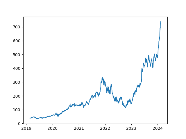
Line Chart in matplotlib python
We can see that the share prices of Nvidia were constantly going up from 2019-22 and then it started to go down between 2022-23 and then started to go up again and went very high at the beginning of 2024. The reason for such a hike in Nvidia stock prices is the result of the explosion of Artificial Intelligence and their revenue from selling GPUs as Nvidia controls more than 95% of the market.
Add Title and Axis Labels
Let’s add a title to the plot using the plt.title() and x and y axis labels using plt.xlabel() and plt.ylabel() respectively.
# create a line chart with title and axis labels
plt.plot(nvidia['Date'], nvidia['Adj Close'])
plt.title("Nvidia Stock Prices (2019-2024)")
plt.xlabel("Year")
plt.ylabel("Adj Close Price")
plt.show()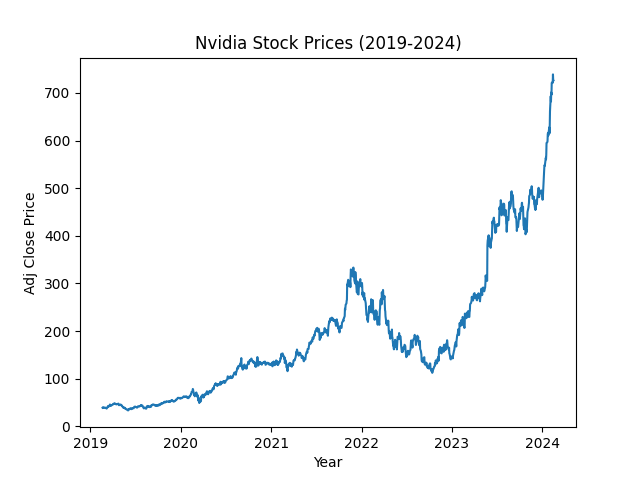
Line Chart with title and axis labels
Multiple Line Charts
To Create multiple line charts on the same figure, we just need to add another plt.plot() function. This will cause matplotlib to create another line chart that shares the same x and y axis as the first graph.
Let’s read some more data for this.
# read data
netflix = pd.read_csv("../data/NFLX.csv", parse_dates=['Date'])
tesla = pd.read_csv("../data/TSLA.csv", parse_dates=['Date'])
# create multiple line charts
plt.plot(nvidia['Date'], nvidia['Adj Close']) # Nvidia
plt.plot(netflix['Date'], netflix['Adj Close']) # Netflix
plt.plot(tesla['Date'], tesla['Adj Close']) # Tesla
plt.title("Stock Prices (2019-2024)")
plt.xlabel("Year")
plt.ylabel("Adj Close Price")
plt.show()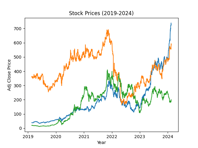
Multiple line charts on the same figure in matplotlib
Instead of writing multiple plot statements as we did before, we can make it a little bit cleaner like this.
dfs = [nvidia, netflix, tesla]

for df in dfs:
    plt.plot(df['Date'], df['Adj Close'])
plt.title("Stock Prices (2019-2024)")
plt.xlabel("Year")
plt.ylabel("Adj Close Price")
plt.show()
Add a Legend
Although we plotted all three lines on the graph, it is not clear which line corresponds to which company. To solve this problem, we need to add a legend to the plot. First, we will add labels to the plt.plot() function and then use the plt.legend() function to add a legend.
# create multiple line charts
dfs = [nvidia, netflix, tesla]
labels = ["Nvidia", "Netflix", "Tesla"]

for df, label in zip(dfs, labels):
    plt.plot(df['Date'], df['Adj Close'], label=label)
plt.title("Stock Prices (2019-2024)")
plt.xlabel("Year")
plt.ylabel("Adj Close Price")
plt.legend()
plt.show()
Line style and color
Instead of using the default color and line style, we can apply our styles. To change the line style use the linestyle and color to change the color.
# create multiple line charts
plt.plot(tesla['Date'], tesla['Adj Close'], label="Tesla",
         linestyle=":", color="blue")

plt.plot(nvidia['Date'], nvidia['Adj Close'], label="Nvidia",
         linestyle="--", color="seagreen")

plt.plot(netflix['Date'], netflix['Adj Close'], label="Netflix",
        linestyle="-.", color='crimson')

plt.title("Stock Prices (2019-2024)")
plt.xlabel("Year")
plt.ylabel("Adj Close Price")
plt.legend()
plt.show()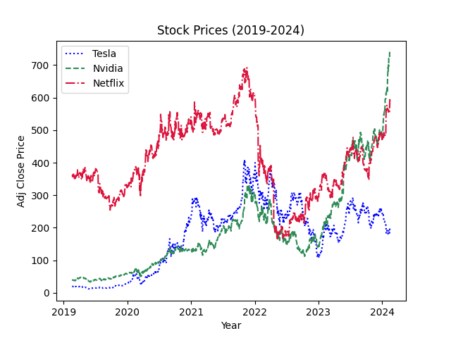
Line chart with custom style and color
I think the plot with solid lines looked much better than this version. There are many other parameters you can use to change the appearance of the line chart, please check the plt.plot() document.
Style Sheets
There are also various style sheets available to change the appearance of your plots. You can list all the styles available using matplotlib.style.available attribute. You can also see the examples of them here - stylesheet reference
# uncomment and run the below line to see
# print(plt.style.available)
To add a style use the plt.style.use(“stylesheet_name“)
# add a style sheet
plt.style.use("seaborn-v0_8-dark")
Line chart with custom stylesheet
Figure size
To change the size of the figure, we can use the figsize parameter of plt.figure() function. The figsize parameter takes a tuple of (width, height) in inches.
# Change figure size
plt.figure(figsize=(8, 6))

# then rest of the code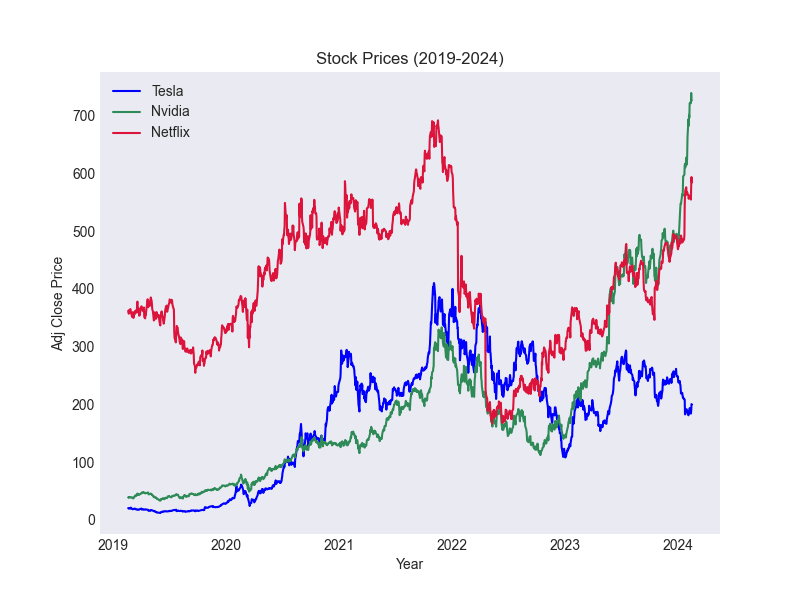
Line chart with custom figure size
Save a Figure
To save a figure in matplotlib use the plt.savefig(“image.png“) function before calling the plt.show(). When saving a figure you have to specify the name of the file with the extension like png, pdf, svg, etc. You can also include a path plt.savefig(“filepath/image.png“) to save it in any other directory.
plt.figure(figsize=(8, 6))

plt.plot(tesla['Date'], tesla['Adj Close'],
         label="Tesla", color="blue")

plt.plot(nvidia['Date'], nvidia['Adj Close'],
         label="Nvidia", color="seagreen")

plt.plot(netflix['Date'], netflix['Adj Close'],
         label="Netflix", color='crimson')

plt.title("Stock Prices (2019-2024)")
plt.xlabel("Year")
plt.ylabel("Adj Close Price")
plt.legend()
# save it in the current directory
plt.savefig("stock_prices_2019_2024.png")
plt.show()
Saving a figure in matplotlib
Exercise 1.1
Read the
WorldExpenditure.csvdata into a Pandas dataframe.Select only the data for
United States of America,China,GermanyandAustralia.Select only the
Total functionin thesectorcolumn that contains aggregated data.You can perform both operations 2 and 3 together if you want to.
Plot
Yearon the x-axis andExpenditure (million USD)on the y-axis.Add a Title and Labels for the x and y axis.
Add a Legend to the plot.
Summary
To Create a Line Chart in matplotlib use the
plt.plot()function.To add a title to the plot use
plt.title()For the x and y-axis labels use the
plt.xlabel()andplt.ylabel()respectively.Multiple line charts can be added to the same figure by adding another
plt.plot()function.To add a legend, first specify
labelfor each plot and then useplt.legend()We can change the line style and color using
linestyleandcolorparameters ofplt.plot()To change the style sheet use
plt.style.use(“stylesheet_name“)To change the figure size use the
figsize=(width, height)parameter ofplt.figure()To save a figure use the
plt.savefig(“filepath/image.png“)
Solution
Exercise 1.1
import warnings
warnings.filterwarnings('ignore')

# import pandas and matplotlib
import pandas as pd
import matplotlib.pyplot as plt
# read data
df = pd.read_csv("../data/WorldExpenditures.csv")
# Filter the data
selected_countries = ['United States of America', 'China', 'Germany', 'Australia']
total_function = df[(df['Sector'] == 'Total function') & (df['Country'].isin(selected_countries))]
# Plot multiple line charts
for country in selected_countries:
country_data = total_function[total_function['Country'] == country]
plt.plot(country_data['Year'], country_data['Expenditure(million USD)'], label=country)
plt.title('Total Government Expenditure Trend (2000-2020)')
plt.xlabel('Year')
plt.ylabel('Expenditure (million USD)')
plt.legend()
plt.show()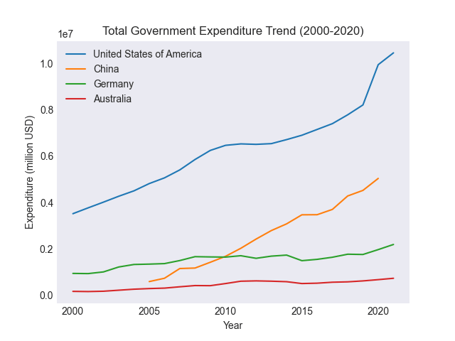
Line chart of Government Expenditure
Subscribe
If you liked this post then please subscribe to our premium Newsletter to get more in-depth articles on data science and programming.
