Histogram in Matplotlib
Histograms are used in data visualization to show the distribution of numerical data. It is used to summarize discrete or continuous data. Each bar in a histogram represents the frequency (the number of occurrences ) of data points within a specific range of values called a bin.
Histograms are particularly useful for understanding the shape of the data such as whether the distribution is symmetric or skewed or if there are any outliers or unusual patterns in the data. Histograms allow us to quickly summarize large datasets and identify patterns and potential issues within the data.
How to Create a Histogram in Matplotlib?
To create a histogram in matplotlib we use the plt.hist() function. This function takes a required parameter x which is the values of the variable for which you want to create a histogram. x can be either a single array or a sequence of arrays that are not required to be of the same length.
import warnings
warnings.filterwarnings('ignore')

import pandas as pd
import matplotlib.pyplot as plt

# read Nvidia Share market data
nvidia = pd.read_csv('../data/NVDA.csv', parse_dates=['Date'])
nvidia.head()
Nvidia stock market data
Let’s create a histogram of Adj Close price column.
# create a histogram
plt.figure(figsize=(8, 6))
plt.hist(nvidia['Adj Close'])
plt.title('Histogram of Nvidia Adj Close Prices')
plt.xlabel('Adjusted Close Price')
plt.ylabel('Frequency')
plt.show()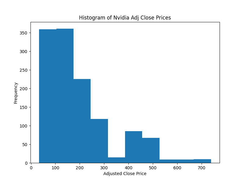
Histogram of Nvidia close prices
We can see that the data is right-skewed, most of the values are between around $40 to $300 and then there is a long tail on the right side of the plot. To get a better sense of the data you can supplement the histogram with summary statistics which can be calculated easily using the pandas describe method.
# summary statistics
nvidia['Adj Close'].describe()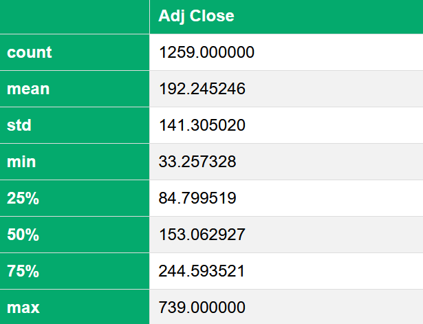
Summary statistics
The minimum close price is $33 and the maximum is $739. the mean close price is around $192 and the median is $153.
Bin Size
The bin size of the histogram can be adjusted using the bins parameter. By default, the bin size is 10. let’s try bin sizes of 20 and 30.
# histogram with custom bin size
for bin_size in [20, 30]:
    plt.hist(nvidia['Adj Close'], bins=bin_size, label=f'Bin Size= {bin_size}')
    plt.title('Histogram of Nvidia Adj Close Prices')
    plt.xlabel('Adjusted Close Price')
    plt.ylabel('Frequency')
    plt.legend()
    plt.show()
Histogram with bin size=20

Histogram with bin size=30
Color
For changing the color as usual we will use the color parameter. Since the brand color of Nvidia is green, let’s use that.
plt.figure(figsize=(8, 6))
plt.hist(nvidia['Adj Close'], color='seagreen', bins=30)
plt.title('Histogram of Nvidia Adj Close Prices')
plt.xlabel('Adjusted Close Price')
plt.ylabel('Frequency')
plt.show()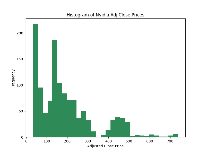
Histogram with custom color
Multiple Histogram
You can also create multiple histograms on the same plot. let’s read the Framingham Heart Study data to illustrate this.
framingham = pd.read_csv('../data/framingham.csv')
framingham.head()
Framingham Heart Study data
Now, Let’s plot a histogram of Systolic blood pressure for Male and Female.
male_df = framingham[framingham['sex']=='Male']
female_df = framingham[framingham['sex']=='Female']

# Plot histograms for Systolic blood pressure for Male and Female
plt.figure(figsize=(8, 6))
plt.hist(male_df['sysBP'], bins=30, label='Male', color='tab:blue')       # Male
plt.hist(female_df['sysBP'], bins=30, label='Female', color='tab:red')    # Female
plt.title('Histogram of Systolic Blood Pressure by Gender')
plt.xlabel('Systolic Blood Pressure (sysBP)')
plt.ylabel('Frequency')
plt.legend()
plt.show()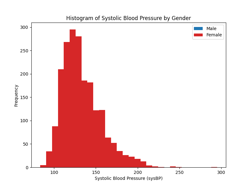
Systolic blood pressure of Male and Female
Although we plotted the separate bars for males and females, the males’ data was hidden behind the females. There are several methods we can take to solve this problem. One simple solution is to use the alpha parameter to add transparency to the plot.
# histograms of Systolic blood pressure for Male and Female
plt.figure(figsize=(8, 6))
plt.hist(male_df['sysBP'], bins=30, label='Male', color='tab:blue')
plt.hist(female_df['sysBP'], bins=30, alpha=0.5, label='Female', color='tab:red')
plt.title('Histogram of Systolic Blood Pressure by Gender')
plt.xlabel('Systolic Blood Pressure (sysBP)')
plt.ylabel('Frequency')
plt.legend()
plt.show()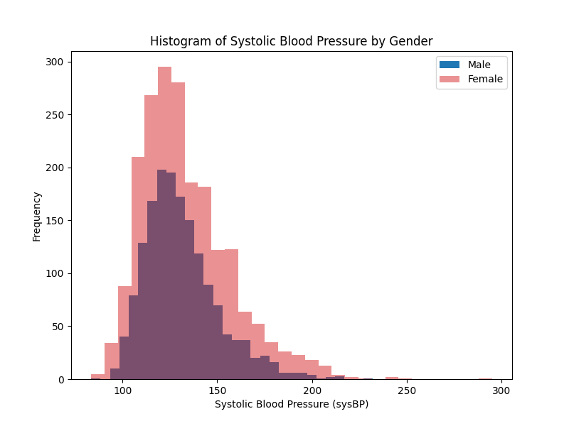
Histogram with alpha parameter
Histogram Types
Another method for solving this problem is using the histtype parameter in plt.hist(). Setting it to step will generate a line plot that is by default unfilled. The other histtype is bar(default) which is a traditional bar-type histogram, barstacked is a bar-type histogram where multiple data are stacked on top of each other and stepfilled is another variation of step but by default, it is filled.
# histograms for Systolic blood pressure for Male and Female
plt.figure(figsize=(8, 6))

plt.hist(male_df['sysBP'], bins=30, histtype='step',
         label='Male', color='blue')

plt.hist(female_df['sysBP'], bins=30, histtype='step',
         label='Female', color='red')

plt.title('Histogram of Systolic Blood Pressure by Gender')
plt.xlabel('Systolic Blood Pressure (sysBP)')
plt.ylabel('Frequency')
plt.legend()
plt.show()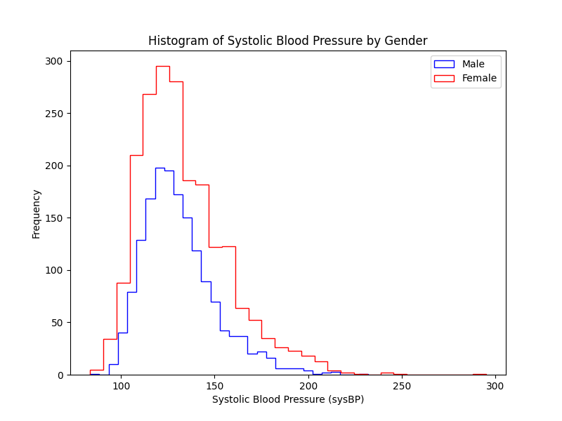
Histogram with step hist type
density
The plt.hist() function also has a parameter called density that plots probability density instead of frequency. When we use frequency the height of each bar represents the number of observations within each bin. But when we use probability density, matplotlib normalizes the histogram such that the area under the histogram sums to 1 which means that the height of each bar will now reflect the probability of observations falling within each bin, relative to the total dataset.
The density parameter is useful when you want to compare the shape of distribution rather than absolute counts, especially when dealing with datasets of different sizes.
# histograms of sysBP for Male and Female with density=True
plt.figure(figsize=(8, 6))

plt.hist(male_df['sysBP'], bins=30, histtype='step',
         label='Male', color='blue', density=True)

plt.hist(female_df['sysBP'], bins=30, histtype='step',
         label='Female', color='red', density=True)

plt.title('Normalized Histogram of Systolic Blood Pressure by Gender')
plt.xlabel('Systolic Blood Pressure (sysBP)')
plt.ylabel('Density')
plt.legend()
plt.show()
Normalized Histogram
Orientation
The orientation parameter in plt.hist() specifies the orientation of the histogram bars. By default, histograms are plotted vertically, but you can change this behavior by setting orientation=’horizontal’ which rotates the histogram so that the bars extend horizontally from the y-axis towards higher counts or densities on the x-axis.
# horizontal histogram
plt.figure(figsize=(8, 6))

plt.hist(male_df['sysBP'], bins=30, histtype='step',
         label='Male', color='blue', orientation='horizontal')

plt.hist(female_df['sysBP'], bins=30, histtype='step',
         label='Female', color='red', orientation='horizontal')

plt.title('Horizontal Histogram of Systolic Blood Pressure by Gender')
plt.xlabel('Frequency')
plt.ylabel('Systolic Blood Pressure (sysBP)')
plt.legend()
plt.show()
Horizontal Histogram
2D Histogram
A 2D histogram is used to represent the joint distribution of two variables by dividing the plane into bins and counting the number of observations in each bin. It is useful for visualizing the relationship between two variables, similar to a scatter plot but with a focus on the density of points.
To create a 2D histogram in matplotlib use the plt.hist2d() function. Let’s create a 2D histogram to visualize the relationship between systolic and diastolic blood pressure.
# 2D histogram of blood pressure
plt.hist2d(framingham['sysBP'], framingham['diaBP'], bins=30)
plt.colorbar()
plt.xlabel('Systolic Blood Pressure')
plt.ylabel('Diastolic Blood Pressure')
plt.title('2D Histogram of Blood Pressure')
plt.show()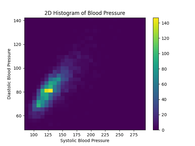
2D Histogram of blood pressure
Exercise 4.1
Create a Histogram of
BMI(Body Mass Index)Create a Multiple Histogram of BMI based on Gender.
Apply various strategies to rectify the plot if there is too much overlap.
Create a density histogram BMI.
Create a 2D histogram of
BMIandtotChol(Total cholesterol).
Summary
To create a histogram in Matplotlib use
plt.hist()function.To change the bin size use the
binsparameter.To change the color of the histogram use
colorparameter.To create another histogram on the same plot add another
plt.hist()function.Use the
alphaparameter to add transparency to the histogram plot.Use the
histtypeto create different types of histograms.Use
densityparameter to create a density histogram.The
orientation='horizontal'parameter is used to create a horizontal histogram.To create a 2D histogram use the
plt.hist2d()function.
Solution
Exercise 4.1
# 1. Create a Histogram of BMI
plt.figure(figsize=(8, 6))
plt.hist(framingham['BMI'], color='crimson')
plt.title('Histogram of Body Mass Index')
plt.xlabel('Body Mass Index')
plt.ylabel('Frequency')
plt.show()
Histogram of body mass index
# 2. Create a Multiple Histogram of BMI based on Gender.
male_df = framingham[framingham['sex']=='Male']
female_df = framingham[framingham['sex']=='Female']

plt.figure(figsize=(8, 6))
plt.hist(male_df['BMI'], color='tab:blue', label='Male')
plt.hist(female_df['BMI'], color='seagreen', label='Female')
plt.title('Histogram of BMI by Gender')
plt.xlabel('BMI')
plt.ylabel('Frequency')
plt.legend()
plt.show()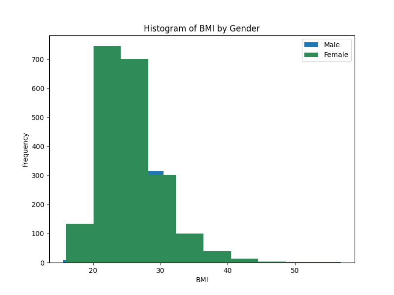
Histogram of BMI by Gender
# 3.Rectify the problem of overlapping by using alpha

plt.figure(figsize=(8, 6))
plt.hist(male_df['BMI'], color='tab:blue', label='Male')
plt.hist(female_df['BMI'], color='seagreen', alpha=0.5, label='Female')
plt.title('Histogram of BMI by Gender')
plt.xlabel('BMI')
plt.ylabel('Frequency')
plt.legend()
plt.show()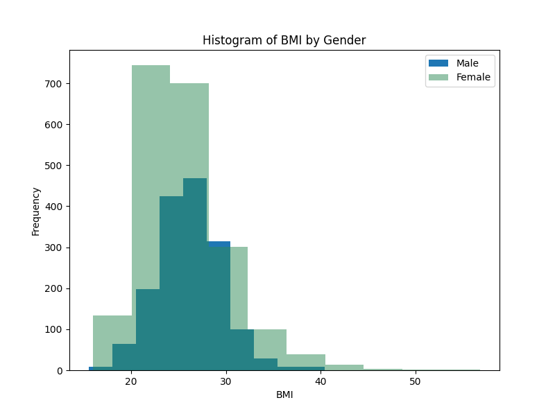
Histogram with alpha parameter
# 3. Rectify the problem of overlapping by changing histogram type

plt.figure(figsize=(8, 6))

plt.hist(male_df['BMI'], color='tab:blue',
         histtype='step', label='Male')

plt.hist(female_df['BMI'], color='seagreen',
         histtype='step', label='Female')

plt.title('Histogram of BMI by Gender')
plt.xlabel('BMI')
plt.ylabel('Frequency')
plt.legend()
plt.show()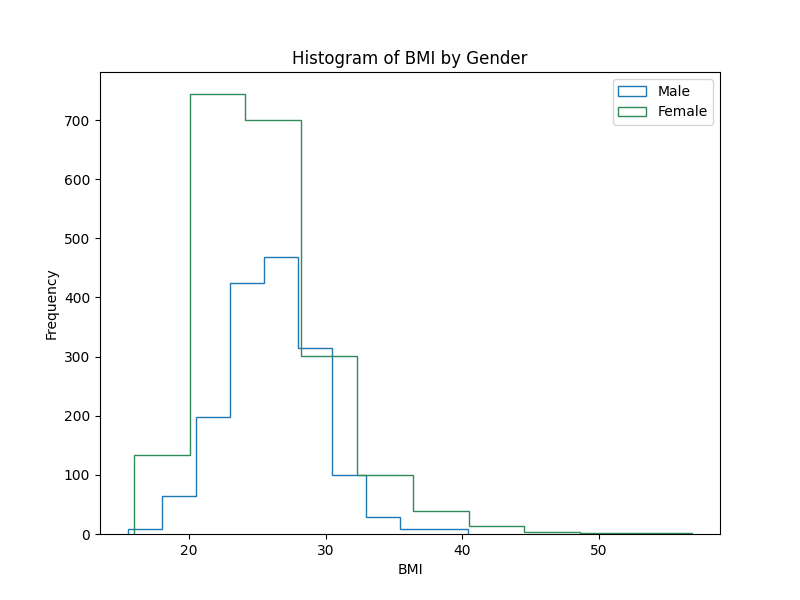
Histogram with step hist type
# 4. Create a density histogram.
plt.figure(figsize=(8, 6))

plt.hist(male_df['BMI'], color='crimson', density=True,
         histtype='step', label='Male')

plt.hist(female_df['BMI'], color='green', density=True,
         histtype='step', label='Female')

plt.title('Histogram of BMI by Gender')
plt.xlabel('BMI')
plt.ylabel('Density')
plt.legend()
plt.show()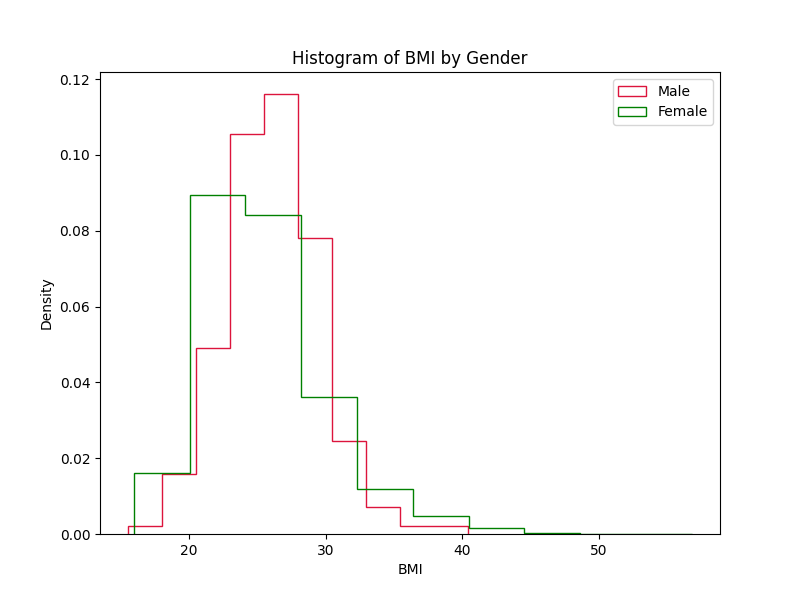
density histogram
# 5. Create a 2D histogram of BMI and totChol

plt.figure(figsize=(8, 6))
plt.hist2d(framingham['BMI'], framingham['totChol'])
plt.colorbar()
plt.title('2D Histogram of BMI and Total Cholesterol')
plt.xlabel('BMI')
plt.ylabel('Total Cholesterol')
plt.show()
2D histogram of BMI and Cholesterol
Subscribe
If you liked this post then please subscribe to our Newsletter to get more in-depth articles on data science and programming.
