Box Plot in Matplotlib
A box plot is also known as a box and whisker plot. A box plot uses boxes and lines to show the distribution of one or more groups or categories of data. A box plot divides a dataset into 4 equal parts and shows a five-number summary of it.
minimum - This shows the minimum value of the dataset excluding outliers.
First quartile (Q1) - 25% of the data lies below the Q1
Median (Q2) - The Q2 is the median of a dataset. It divides the data into two parts. 50% of the data lies below it and 50% above it.
Third quartile (Q3) - 75% of the data lies below the Q3
Maximum - This shows the maximum value of a dataset excluding outliers.
Create a Box Plot in Matplotlib
To create a box plot in matplotlib use the plt.boxplot() function. Let’s read the Framingham heart study data. You can find the data here - matplotlib-python-book
# ignore warnings
import warnings
warnings.filterwarnings('ignore')

# import libraries
import pandas as pd
import numpy as np
import matplotlib.pyplot as plt

# Read data
framingham = pd.read_csv('../data/framingham.csv')
framingham.head()
Heart study data
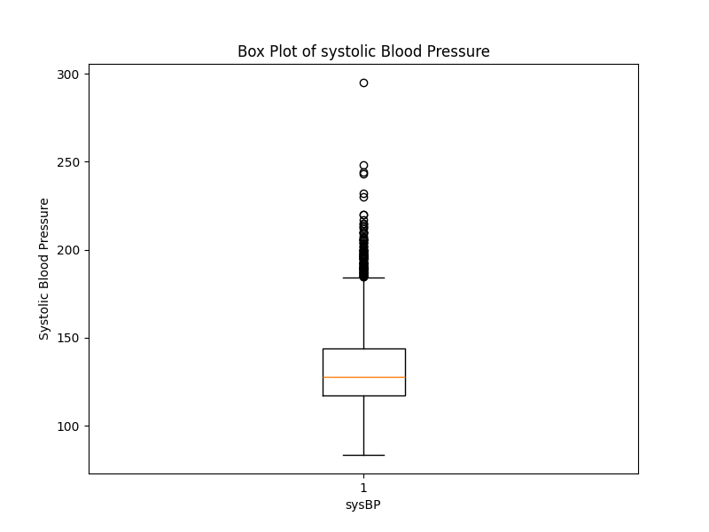
We will create a Box Plot of Systolic Blood Pressure.
# create a box plot of systolic Blood pressure
plt.figure(figsize=(8, 6))
plt.boxplot(framingham['sysBP'])
plt.title('Box Plot of systolic Blood Pressure')
plt.xlabel("sysBP")
plt.ylabel('Systolic Blood Pressure')
plt.show()
Box Plot systolic blood pressure
Multiple Box Plots
You can also create multiple box plots for comparison. let’s plot sysBP and diaBP together on the same plot side by side. Doing this will allow us to directly compare these two distributions. This comparison can be very useful in medical science, where understanding the relationship and differences between systolic and diastolic blood pressure is important.
plt.figure(figsize=(8, 6))

plt.boxplot([framingham['sysBP'], framingham['diaBP']],
            labels=['sysBP','diaBP'])

plt.title('Box Plot of Systolic and Diastolic Blood Pressure')
plt.ylabel('Blood Pressure')
plt.show()
Multiple Box Plots
if you look carefully you can see that I passed the sysBP and diaBP inside a list instead of separate arguments to the plt.boxplot() function. If you pass two arguments then the box plot will throw an error. Each element of the list corresponds to a different box plot, and the labels parameter is used to label each of these plots accordingly.
Adding colors in Box Plots
You can add colors to each box plot using the patch_artist and facecolor. By default, the patch_artist is set to False which means that the boxes in the box plot are drawn using line plots. In this mode, only the outlines of the boxes are shown and they are not filled with any color.
plt.figure(figsize=(8, 6))
plt.boxplot([framingham['sysBP'], framingham['diaBP']],
            labels=['sysBP','diaBP'], patch_artist=True)
plt.title('Box Plot of Systolic and Diastolic Blood Pressure')
plt.ylabel('Blood Pressure')
plt.show()
Box Plots of Blood pressure
To add different colors to each box plot we need to modify our code a little bit as plt.boxplot() itself doesn’t provide a direct argument for setting the face color of the box patch objects.
plt.figure(figsize=(8, 6))
bp = plt.boxplot([framingham['sysBP'], framingham['diaBP']],
                 labels=['sysBP', 'diaBP'], patch_artist=True)

# Set colors for each box plot
colors = ['dodgerblue', 'seagreen']
for patch, color in zip(bp['boxes'], colors):
    patch.set_facecolor(color)

plt.title('Box Plot of Systolic and Diastolic Blood Pressure')
plt.ylabel('Blood Pressure')
plt.show()
Box Plots with custom colors
notch
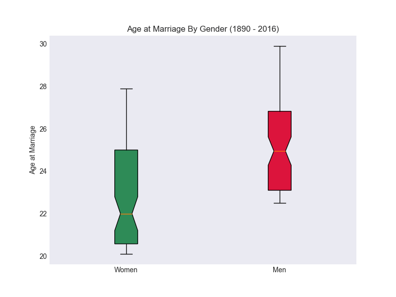
To create a notched boxplot use the notch parameter. The notch represents the confidence interval (CI ) around the median. By default, it is False which means it will create a rectangular box plot.
plt.figure(figsize=(8, 6))
bp = plt.boxplot([framingham['sysBP'], framingham['diaBP']],
                 labels=['sysBP', 'diaBP'], patch_artist=True,
                notch=True)

# Set colors for each box plot
colors = ['dodgerblue', 'seagreen']
for patch, color in zip(bp['boxes'], colors):
    patch.set_facecolor(color)

plt.title('Notched Box Plot of Systolic and Diastolic Blood Pressure')
plt.ylabel('Blood Pressure')
plt.show()
Notched Box Plot
Changing the shape and color of outliers
When we create a box plot, by default the outliers are represented by small circles. To change the symbol or marker used for outliers use the flierprops parameter. You can also change the color ( markerfacecolor ), edge color ( markeredgecolor) and marker size ( markersize).
# outliers properties
flierprops = dict(marker='d',       # diamond shape
                  markerfacecolor='green',  # green fill
                  markeredgecolor='black',  # Black edge color
                  markersize=8)   # Size of the marker

# Create the box plot with customized outlier symbols
plt.figure(figsize=(8, 6))
plt.boxplot([framingham['sysBP'], framingham['diaBP']], labels=['sysBP', 'diaBP'],
            flierprops=flierprops, patch_artist=True)

plt.title('Box Plot of Blood Pressure with Custom Outliers')
plt.ylabel('Blood Pressure')
plt.show()
Box plot with custom outliers
Remove Outliers
To remove the outliers from the plot use the showfliers and set it to False. By default, it is set to True which means outliers (fliers) are shown.
# Create the box plot without outliers
plt.figure(figsize=(8, 6))
plt.boxplot([framingham['sysBP'], framingham['diaBP']], labels=['sysBP', 'diaBP'],
            showfliers=False, patch_artist=True, notch=True)
plt.title('Box Plot of Systolic and Diastolic Blood Pressure without Outliers')
plt.ylabel('Blood Pressure')
plt.show()
Box plot without outliers
Horizontal Box Plot
To create a horizontal box plot in Matplotlib use the vert parameter of plt.boxplot() function and set it to False . By default, box plots are vertical ( vert = True )
# Create a Horizontal Box plot
plt.figure(figsize=(8, 6))

plt.boxplot([framingham['sysBP'], framingham['diaBP']],
            labels=['sysBP', 'diaBP'],
            vert=False, showfliers=False)

plt.title('Horizontal Box Plot')
plt.xlabel('Blood Pressure')
plt.show()
Horizontal Box Plot
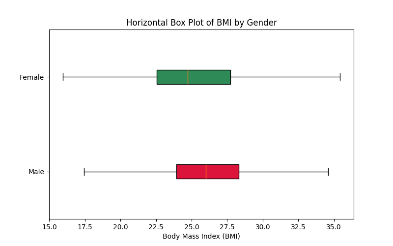
Another variation of multiple box plots could be plotting box plots for different groups of data. Let’s create a box plot of BMI for males and females.
male_df = framingham[framingham['sex'] == 'Male']
female_df = framingham[framingham['sex'] == 'Female']

# Create a Horizontal Box plot
plt.figure(figsize=(8, 5))
bp = plt.boxplot([male_df['BMI'], female_df['BMI']], labels=['Male', 'Female'],
            vert=False, showfliers=False, patch_artist=True)

# Set colors for each box plot
colors = ['crimson', 'seagreen']
for patch, color in zip(bp['boxes'], colors):
    patch.set_facecolor(color)

plt.title('Horizontal Box Plot of BMI by Gender')
plt.xlabel('Body Mass Index (BMI)')
plt.show()
Horizontal Box Plot
Exercise 5.1
Read the
marriage-age-2016.txtin pandas with sep=’\t’ parameter.Create a new column with the difference in age between Men and Women.
Create a box plot of
age_diffcolumn.Create multiple box plots of Men and Women's age at marriage.
Add different colors to each box plot.
Turn the plot to a notched box plot.
Turn the same plot into a horizontal box plot.
Bonus - Create a Line chart of men’s and women’s age at marriage and also the age difference.
Summary
To create a Box plot in matplotlib use the
plt.boxplot()function.To create multiple box plots, pass the array in a list to the box plot function.
To customize the colors of the box plots use the
patch_artistandfacecolorparameters.For the notched box plot use the
notchTo change the shape of outliers use
fliersprops.To remove the outliers set
showfliers=False.To create a horizontal box plot set the
vert=False.
Solution
Exercise 5.1
# 1. Read the `marriage-age-2016.txt` in pandas
marriage = pd.read_csv('../data/marriage-age-2016.txt', sep='\t')

# 2. Create new column age_diff
marriage['age_diff'] = marriage['Men'] - marriage['Women']

# 3. Create a Box Plot of age_diff column
import matplotlib.pyplot as plt
plt.style.use('seaborn-v0_8-dark')

plt.figure(figsize=(6,5))
plt.boxplot(marriage['age_diff'], labels=['age_diff'])
plt.ylabel('Age difference at marriage')
plt.show()
Box Plot of Age difference at marriage
# 4. multiple box plot of Men and Women age at marriage.
plt.figure(figsize=(8, 6))
plt.boxplot([marriage['Women'], marriage['Men']], labels=['Women', 'Men'])
plt.title("Age at Marriage By Gender (1890 - 2016)")
plt.ylabel("Age at Marriage")
plt.show()
Box plot of men and women age at marriage
# 5. Add different colors to each box plot.
plt.figure(figsize=(8, 6))
bp = plt.boxplot([marriage['Women'], marriage['Men']],
            labels=['Women', 'Men'], patch_artist=True)

# Set colors for each box plot
colors = ['seagreen', 'crimson']
for patch, color in zip(bp['boxes'], colors):
    patch.set_facecolor(color)

plt.title("Age at Marriage By Gender (1890 - 2016)")
plt.ylabel("Age at Marriage")
plt.show()
Box plot with custom box
# Turn the plot to a notched box plot
bp = plt.boxplot([marriage['Women'], marriage['Men']], notch=True,
            labels=['Women', 'Men'], patch_artist=True)
Notched box plot
# 7. horizontal box plot
bp = plt.boxplot([marriage['Women'], marriage['Men']], notch=True,
            vert=False, labels=['Women', 'Men'], patch_artist=True)
Horizontal Box plot
# 8. Bonus - Line chart of men and women age at marriage
plt.style.use('seaborn-v0_8-dark')
plt.figure(figsize=(8,6))
plt.plot(marriage['Year'], marriage['Men'], label='Men', color='crimson')
plt.plot(marriage['Year'], marriage['Women'], label='Women', color='seagreen')
plt.title('Age at Marriage By Gender  (1890 - 2016)')
plt.xlabel('Year')
plt.ylabel('Age at Marriage')
plt.legend()
plt.show()
Line chart of men and women's age at marriage
# 8. Bonus Line chart of men and women age difference.
plt.figure(figsize=(8,6))
plt.plot(marriage['Year'], marriage['age_diff'], color='crimson')
plt.title('Age Difference at Marriage (1890 - 2016)')
plt.xlabel('Year')
plt.ylabel('Age difference at Marriage')
plt.show()
Line chart of age difference at marriage
Subscribe
if you liked this article then subscribe to read more in-depth articles on data science and programming.
