Bar Charts in Matplotlib
A Bar Chart is a type of graph that uses bars to display information in a way that allows easy comparison between different categories. The bar charts in data visualization are used to display and compare the frequency, count, mean, etc. The bars can be either vertical or horizontal depending on how you display information.
You can use a bar chart to compare monthly sales of different products or categories, how many books you read each month, how many cats and dogs your neighborhood has, and what kind of ice cream flavors sell more in a store. Bar charts make it easier to understand numbers by showing them as bars. The longer the bar the bigger the number. This makes it simple to see more, less, or how different things compare.
Create a Bar Chart in Matplotlib
To create a bar chart use the plt.bar(x, height) function in matplotlib. The most important parameters for creating a bar chart are the x and the height. The x represents the x coordinates of the bars and the height represents the heights of each bar.
Let’s read a data set to work with. You can find the data here - matplotlib-python-book
# filter warnings
import warnings
warnings.filterwarnings('ignore')

# import pandas and matplotlib
import pandas as pd
import matplotlib.pyplot as plt

# read data
df = pd.read_csv("../data/insurance.csv")
df.head()
Insurance data
Vertical bar Chart
The most common type of Bar Chart is the Vertical bar Chart. In this type of chart, categories are displayed along the x-axis, and the lengths of the bars along the y-axis.
Let’s try to understand the average insurance charges for smokers vs non-smokers. To visualize this we have to first calculate the average insurance charges for each group.
# average insurance charges for smokers vs. non-smokers
average_charges = df.groupby('smoker')['charges'].mean().reset_index()
Now, let’s create a bar chart in matplotlib.
# Create a vertical bar chart
plt.figure(figsize=(7, 6))
plt.bar(average_charges['smoker'], average_charges['charges'])
plt.title('Average Insurance Charges: Smokers vs. Non-Smokers')
plt.xlabel('Smoker')
plt.ylabel('Average Insurance Charges')
plt.show()
Bar chart of smokers vs non-smokers
As we can see smokers tend to have significantly higher average insurance charges compared to non-smokers, highlighting the impact of smoking on insurance costs. We can further improve this chart by changing the colors of each bar. We will color the bar for smokers red and the non-smokers green.
# Create a vertical bar chart
plt.figure(figsize=(7, 6))
plt.bar(average_charges['smoker'], average_charges['charges'],
       color=['seagreen', 'crimson'])
plt.title('Average Insurance Charges: Smokers vs. Non-Smokers')
plt.xlabel('Smoker')
plt.ylabel('Average Insurance Charges')
plt.show()
Bar chart with custom bar colors
Here, I am using different shades of red and green color. Since the first bar represents non-smokers and the second bar for smokers, I passed the list of colors in that order. let’s also add a grid to this plot
Add Grid Lines
To add grid lines in matplotlib use the plt.grid() function. In the following code, I have added a grid with the alpha parameter to add transparency to the grid lines because I don’t want the grids to dominate the chart. Several other parameters like axis let you specify whether you want the grid on the x-axis or y-axis or both axis. Please check the document for more details - grid document.
# Create a vertical bar chart
plt.figure(figsize=(7, 6))
plt.bar(average_charges['smoker'], average_charges['charges'],
       color=['seagreen', 'crimson'])
plt.title('Average Insurance Charges: Smokers vs. Non-Smokers')
plt.xlabel('Smoker')
plt.ylabel('Average Insurance Charges')
# add grid with transparency
plt.grid(alpha=0.3)
plt.show()
Bar chart with grid lines
Width of the Bars
To change the width of the bars use the width parameter. By default, it is 0.8.
plt.figure(figsize=(7, 6))
plt.bar(average_charges['smoker'], average_charges['charges'],
       color=['seagreen', 'crimson'], width=0.4)
plt.title('Average Insurance Charges: Smokers vs. Non-Smokers')
plt.xlabel('Smoker')
plt.ylabel('Average Insurance Charges')
plt.grid(alpha=0.3)
plt.show()
Bar chart with custom bar width
Horizontal Bar Chart
Horizontal Bar charts are similar to vertical bar charts, but the categories are displayed on the y-axis and the bars extend horizontally towards the x-axis. This format is particularly useful for displaying long category labels or when there are many categories.
To create a horizontal bar chart use the plt.barh() function.
# Calculate the average insurance charges by region
avg_region = (df.groupby('region')['charges']
              .mean()
              .round(2)
              .reset_index()
              .sort_values(by='charges'))
avg_region.head()
Average Insurance charges by region
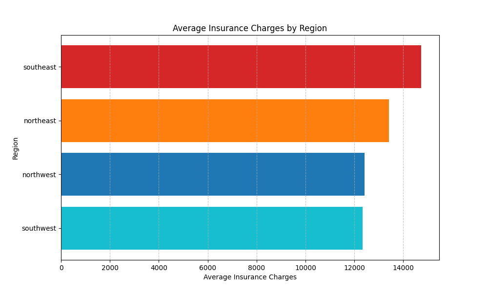
If you look carefully, you will see that I have also sorted the data by charges in ascending order above which will create a natural progression of the bars. The bar with the highest charges will show up at the top and the bar with the lowest charges will show up at the bottom. This makes comparing bars much easier. You can also reverse the order of bars by changing the sorting order.

Horizontal bar chart of avg. insurance charges by region
Note: In plt.barh(y, width), the second argument is the width of the bar, not their height. This is a key difference from the plt.bar() function that uses vertical bars, where the second argument represents the height of the bars.
In a horizontal bar chart, bars extend horizontally from the y-axis, so width in this context correspond to the value they represent. The height of bars in a horizontal chart is determined automatically based on the number of bars and the size of the plot or you can set it manually using the height parameter.
plt.figure(figsize=(10, 6))
plt.barh(avg_region['region'], avg_region['charges'],
         color=['tab:cyan', 'tab:blue', 'tab:orange', 'tab:red'],
        height=0.5) # set the height
plt.title('Average Insurance Charges by Region')
plt.xlabel('Average Insurance Charges')
plt.ylabel('Region')
plt.grid(axis='x', linestyle='--', alpha=0.7)
plt.show()
Horizontal bar chart with adjusted bar height
We can see the average insurance charges are highest in southeast region and lowest in southwest region.
Exercises 3.1
Calculate the average insurance charges based on
sex (gender).Create a vertical bar chart for the average insurance charges by sex.
Change the colors of the bars other than the default. You can find more info here - matplotlib colors or html color codes
Add grid lines to the plot and experiment with different grid options available in matplotlib - grid document
Change the width of the bars.
Exercise 3.2
Read the
penguins.csvdata in pandas dataframe.Calculate the average body mass of penguins by species.
Create a horizontal bar chart by species.
Change the height and colors of the bars.
Stacked Bar Chart
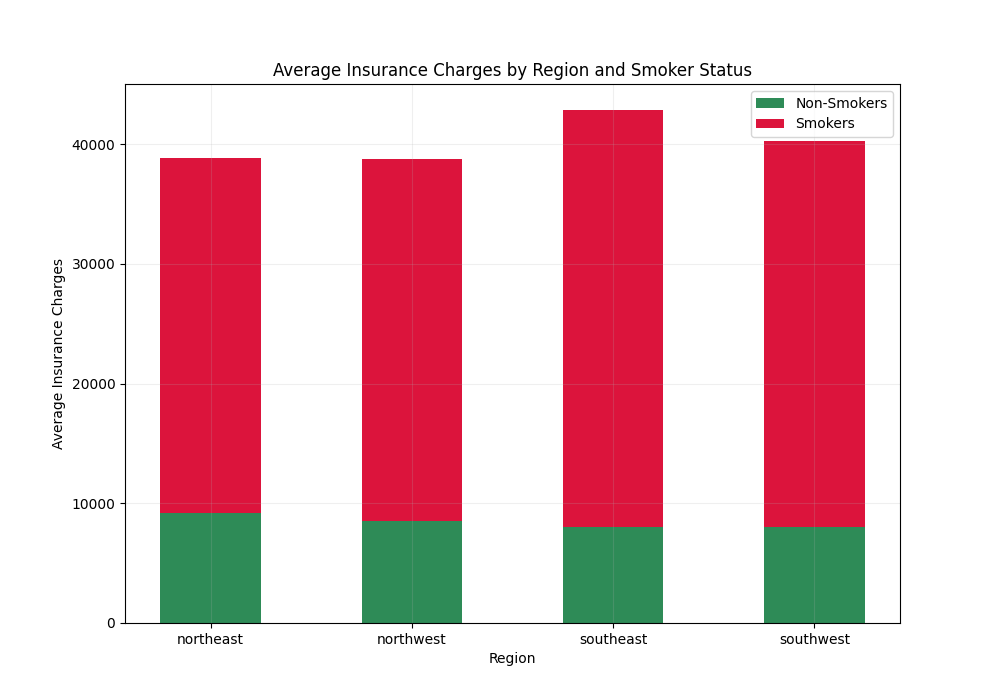
A stacked bar chart is used in data visualization to segment the categories into sub-categories, where the total length of each bar represents the combined total of its sub-categories. This is done by stacking the sub-category values on top of each other within each category. Stacked bar charts can be both vertical or horizontal but they are most commonly seen in a vertical format.
To create a stacked bar chart using the insurance data, we can segment the region into smokers vs non-smokers for each region. To do that first, we have to group the data by region and then by smoker. Then we will calculate the average insurance charges for each sub-category and unstack the grouped data to get separate columns for smokers vs non-smokers.
# Group by region and smoker and calculate average charges
region_smoker = (df.groupby(['region', 'smoker'])['charges']
                 .mean()
                 .round(2)
                 .unstack())
region_smoker
avg charges by region and smoker
Next, we will set up the plot. We will define the positions for each region on the x-axis and also separate the data for non-smokers and smokers. Separating the data is not necessary but it will make it easier to understand what are we doing
# Separate the data for non-smokers and smokers
non_smokers = region_smoker['no']
smokers = region_smoker['yes']

# Define the positions for the regions on the x-axis
positions = range(len(region_smoker))
positions

#output
range(0, 4)
Next, we will plot the bars for non-smokers and then plot the bars for smokers stacked on top of non-smokers by using the bottom parameter. We will also use plt.xticks() to set the tick locations and labels.
# Create a stacked bar chart
plt.figure(figsize=(10, 7))

# Plot bars for non-smokers
plt.bar(positions, non_smokers, width=0.5, label='Non-Smokers', color='seagreen')

# Plot bars for smokers, stacked on top of non-smokers by using the bottom parameter
plt.bar(positions, smokers, width=0.5, bottom=non_smokers, label='Smokers', color='crimson')

# Add some details
plt.title('Average Insurance Charges by Region and Smoker Status')
plt.xlabel('Region')
plt.ylabel('Average Insurance Charges')
plt.xticks(positions, region_smoker.index)  # Set the x-ticks to match the regions
plt.grid(alpha=0.2)
plt.legend()
plt.show()
Stacked Bar Chart
We can see average insurance charges are very high for smokers in all regions compared to non-smokers.
Exercise 3.3
Group the penguins data by
speciesandsexand calculate theaveragebody mass.Separate the data for female and male
Define the positions of each species on the x-axis.
Create a stacked bar chart for each species segmented by sex.
Grouped Bar Chart
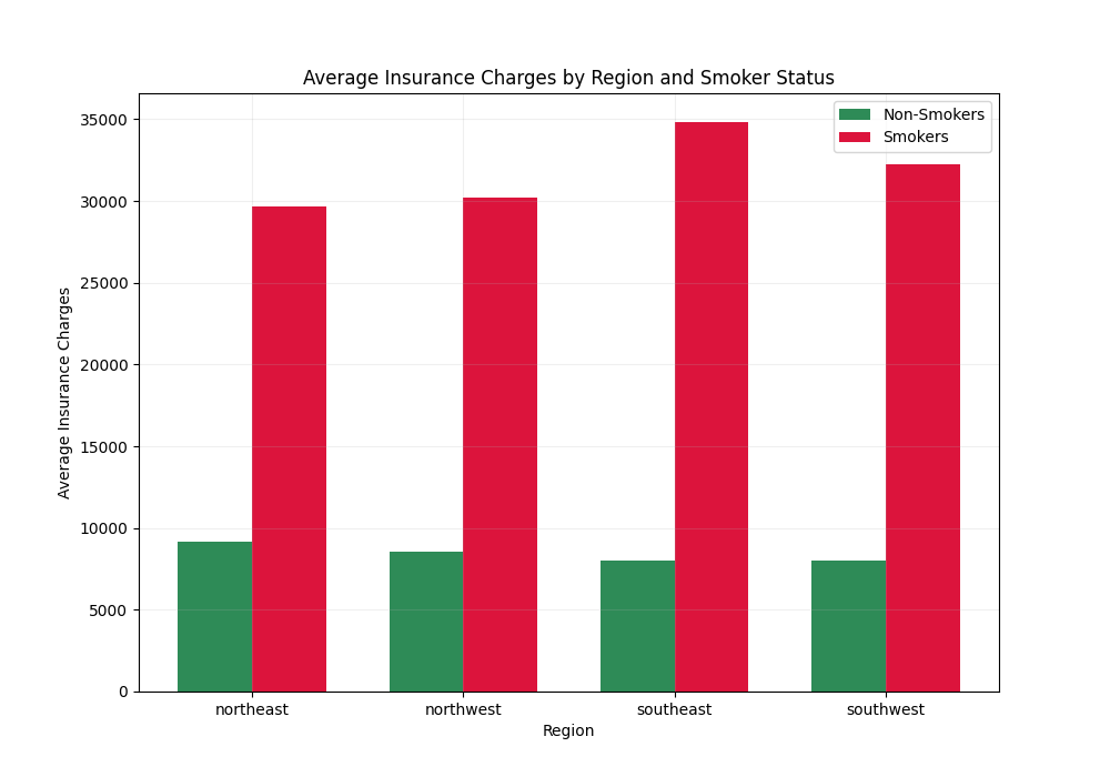
A grouped bar chart also known as a clustered bar chart is another type of bar chart that is used to compare different categories. It displays multiple bars for each sub-category side by side for each category. Instead of stacking the bars as we did with the stacked bar chart, the grouped bar chart plots each sub-category side by side.
Let’s turn our previously created stacked bar chart into a grouped bar chart. First, we need to determine the positions of the bars on the x-axis. To plot bars side by side, we’ll adjust these positions for each sub-category within a group. This requires shifting the positions slightly left or right from the central position for each group.
import numpy as np

# Define the width of the bars and the positions
bar_width = 0.35
n_regions = len(region_smoker.index)
index = np.arange(n_regions)

# Calculating positions for smokers and non-smokers
positions_non_smokers = index - bar_width / 2
positions_smokers = index + bar_width / 2
Since we have four regions, the n_regions=4 and the index = [0, 1, 2, 3] . Next, we are creating positions for non-smokers. For this, we subtract half the bar_width from each index to position the bars slightly to the left of the central point of their respective groups. Similarly, we also calculated the positions of the bars for smokers by adding half the bar_width to each index which position the bars slightly to the right of the central point of their respective groups.
Now, we just have to plot two bar charts, one for non-smokers and one for smokers.
# Plotting the bars for non-smokers and smokers
plt.figure(figsize=(10, 7))

plt.bar(positions_non_smokers, non_smokers,
        width=bar_width, label='Non-Smokers', color='seagreen')

plt.bar(positions_smokers, smokers,
        width=bar_width, label='Smokers', color='crimson')

# Adding chart details
plt.xlabel('Region')
plt.ylabel('Average Insurance Charges')
plt.title('Average Insurance Charges by Region and Smoker Status')
plt.xticks(index, region_smoker.index)
plt.grid(alpha=0.2)
plt.legend()
plt.show()
Grouped bar chart
Exercise 3.4
Convert the stacked bar chart of Exercise 3.3 to the grouped bar chart.
Summary
To create a vertical bar chart in matplotlib use the
plt.bar()function.The width of the bars in the vertical bar chart is adjusted with the
widthparameter.To create a horizontal bar chart use the
plt.barh()function.The width of the bars in the horizontal bar chart is adjusted by the
heightparameter.In a stacked bar chart sub-categories are stacked on top of each other for every category.
In a grouped bar chart sub-categories are placed side by side for each category.
Solutions
Exercise 3.1
# read insurance data
df = pd.read_csv("../data/insurance.csv")

# calculate average insurance charges by sex
average_charges_sex = df.groupby('sex')['charges'].mean().reset_index()

# create vertical bar chart
plt.figure(figsize=(6, 6))

plt.bar(average_charges_sex['sex'], average_charges_sex['charges'],
       color=['crimson', 'blue'], width=0.3)

plt.title('Average Insurance Charges by Sex')
plt.xlabel('Sex')
plt.ylabel('Average Insurance Charges')
plt.grid(axis='y', linestyle='--', alpha=0.4)
plt.show()
Average insurance charges by sex
Exercise 3.2
# read penguins data
penguins = pd.read_csv('../data/penguins.csv')

# calculate the average body mass of the penguin species

avg_species = (penguins.groupby('species')['body_mass_g']
               .mean()
               .reset_index()
               .sort_values(by='body_mass_g'))

# create a horizontal bar chart
plt.figure(figsize=(8, 6))

plt.barh(avg_species['species'], avg_species['body_mass_g'],
        color=['tab:cyan', 'tab:blue', 'tab:orange'], height=0.5)

plt.title("Average Body Mass By Penguin Species")
plt.xlabel("Average Body Mass")
plt.ylabel("Penguin Species")
plt.show()
Horizontal bar chart
Exercise 3.3
# Group by species and sex and calculate the average body mass.
species_sex = (penguins.groupby(['species','sex'])['body_mass_g']
               .mean().unstack())

# Seperate the data for male and female
penguins_male = species_sex['MALE']
penguins_female = species_sex['FEMALE']

# define the positions of the groups on the x-axis
positions = range(len(penguins_female))

# create a Stacked Bar chart for each species.
plt.figure(figsize=(7, 6))

plt.bar(positions, penguins_male, width=0.4, label='Male',
        color='teal')

plt.bar(positions, penguins_female, width=0.4, bottom= penguins_male,
        label='Female', color='deeppink')

plt.title("Average Body Mass by Penguins Species and Gender")
plt.xlabel("Species")
plt.ylabel("Average Body Mass")
plt.xticks(positions, species_sex.index)
plt.legend()
plt.show()
stacked bar chart
Exercise 3.4
import numpy as np

bar_width = 0.35
n_species = len(penguins_female.index)
index = np.arange(n_species)

positions_male = index - bar_width / 2
positions_female = index + bar_width / 2

plt.figure(figsize=(8, 6))
plt.bar(positions_male, penguins_male,
        width=bar_width, label='Male', color='teal')
plt.bar(positions_female, penguins_female,
       width=bar_width, label='Female', color='deeppink')
plt.title("Average Body Mass by Penguin Species and Gender")
plt.xlabel("Species")
plt.ylabel("Average Body Mass")
plt.xticks(index, penguins_female.index)
plt.legend()
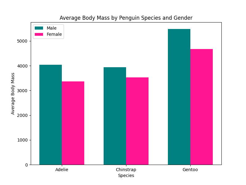
plt.show()
grouped bar chart
Subscribe
If you liked this post then please subscribe to our Newsletter to get more in-depth articles on data science and programming.
